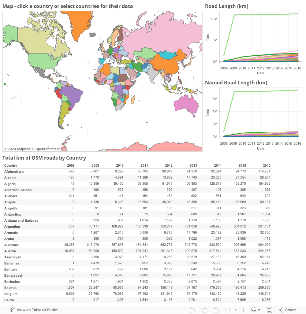
Building an understanding of gaps left to be mapped means understanding what and how local OSM communities have been able to map. Working with some partners we created a simple Tableau visualization that shows the growth of OSM overtime. Visualizing the growth of an OSM community allows us to understand where the local community is in its growth and helps us determine what methods we might use to help build up the mapping community. Together with some other tools such as the Missing Maps leaderboards and OSM Analytics we are building a great understanding of where the maps are missing. The country stats only looks at road length and road names. Road length is usually a good proxy for overall map coverage and road name is usually a good proxy for map quality. Overall map density continues to grow, the map is filling out thanks to a combination of dedicated local mappers and institutional actors like Missing Maps. It is truly impressive how much data has been added to the map in such a few short years. With more partners and projects we can do even more.
I’ve highlighted three countries that peaked my interest below.
When I first looked at the stats the first thing that jumped out at me was the rapid increase of mapping data in the US. I wasn’t part of the project back then so I did a little research and found out that the increase is do the TIGER Import. Seeing these types of massive data increases helps to understand how the mapping community has grown. These changes the way that we engage local mappers and community groups.

TIGER Import progress CC-BY-SA OSM
My first real experience with HOT and OSM was Typhoon Haiyan in the Philippines. Remote volunteers contributed over 4.5 million map edits in just 3 months. I expected a huge spike in the road data during this period. However, after reviewing the numbers the is a small uptick in edits but its right in line with the overall organic growth of OSM data in the Philippines. The Philippines mapping community is one of the strongest and most dedicated group of mappers I know. The Philippines gets hit by an average of 20 typhoons a year. Having good data is very important to helping to save lives. Many groups including the local governments have switched to using OSM as the source for maps during disasters and the Philippine mapping is at the heart of this adoption and switch. How we as the Red Cross and Missing Maps work with them is drastically different than in Guinea.

Philippines Stats
Guinea has a much different history of map data. Prior to the 2013 Ebola outbreak very little road data existed. Over the 18 or so months that HOT and others were involved you can clearly see the huge uptake in road length. The Guinea mapping community is still in its early days. We at the Red Cross are working to grow both the map and the mapping community to help create the sustainable growth that we see in places like the Philippines.

Guinea Stats
Explore the data yourself, select countries or groups of countries to see their data over time. Identify places where you can have an impact and go map.